Financial Wellbeing App
ClearScore
Role: Designer and lead user researcher. Small R&D team consisted of 2 other UX designers, 2 UI, 2 Developers
Context: Creating an app to improve Financial Wellbeing for FinTech leader ClearScore
Duration: March 2018- June 2019
Challenge
ClearScore’s mission is about making finances less complicated and more human. They aimed to evolve the current product and take the mission statement a step further to improving people’s financial wellbeing. The brief was to create an MVP for an app, that pushed boundaries and tapped into emotions to help users buy their first house.
Approach
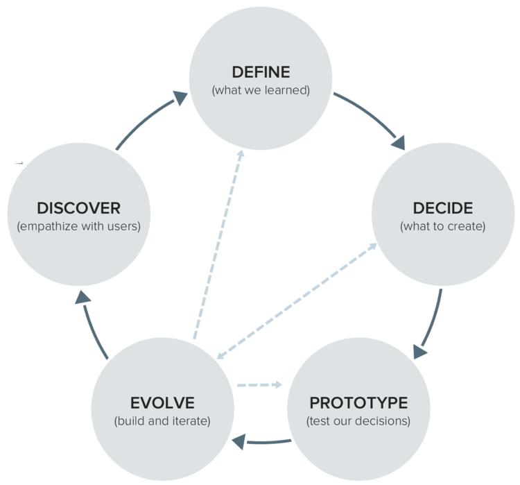
We implemented a lean UCD process throughout the project. Working closely in a small team (in our own office) improved collaboration and velocity.
Exploring financial wellbeing
Workshops, design sprints, interviews, desk research, competitor research
We identified that people have problems in managing money due to lack of awareness and education of their own finances, behavioural and personality traits, as well as circumstances and consequences of past behaviour.
We interweaved the aspects of increasing awareness, education and behaviour change through the journey of helping a first time buyer prepare their finances to buy a house.
Outlining key behavioural pillars of financial wellbeing
Target users
Conducted user interviews to understand money problems, attitudes, mental models and behaviour of ClearScore users. Analysed and grouped behavioural data into persona groups; the development of personas was an ongoing process throughout the project.
I identified a set of 5 user personas (grouped by financial situation, and financial activity and attitude). These two personas (presented) were the strongest fit for our product, and we focused on the Stable Less Active persona primarily when designing the happy path.
Two personas to describe a Stable/less active person, and a Struggling/active person
Concepts and proposition testing
We ideated on how to give people a measure of their financial wellbeing and how to display the data using a score.
Evolved the proposition through testing several concepts and evaluating whether it fulfils a tangible need. We learned that facing the truth about money situations is emotional and that people want insight and advice without judgement.
Content mapping
We created content topics and prioritised them to define the MVP scope, considering both user and business needs.
I worked with the copywriter to form the tone of voice for the app and wrote a paper on OneScore’s philosophy on Financial Wellbeing to align the team.
User journeys
Designed the content, flows and wireframes for each user journeys, along with another UX designer.
The aim was to create bite-size steps so information is easy to digest. The structure enabled users to learn about a topic and progress through tasks.
Working with a behavioural psychologist I learned about reward systems and gamification to inform the value exchange strategy.
User flow to show the journey through the “book” sections of the app
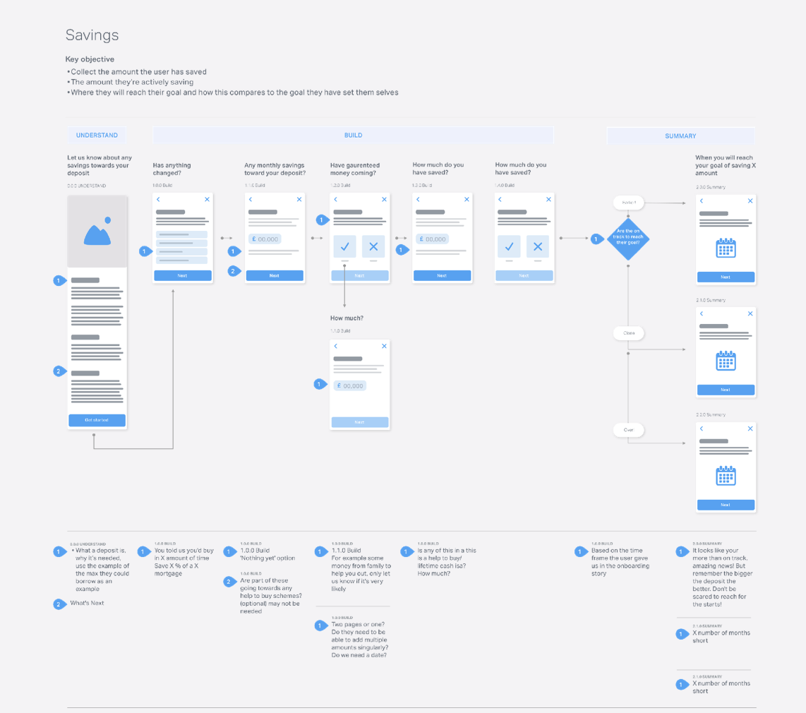
Wireframes for user journeys; taking the user a step at a time to understand their financial goal
Outputs of a design sprint about how to facilitate users’ trust in open banking to open up more suitable credit options. Whilst remaining transparent we decided to not mention the term “open banking” which could trigger uninformed assumptions, and instead focused on communicating the user output and benefit.
User testing and iterating
I managed the research process, from recruiting users to analysis of findings. Gathering feedback regularly helped guide decision making and assess the potential success of the app.
We did guerrilla testing for immediate feedback of design ideas, and in-depth user tests and interviews with ClearScore users to understand reasons behind why a journey did or did not work. I set up quantitative usage measures to evaluate the Beta release.
I grouped the findings and colour-coded sentiments. We mapped issues and solutions on an effort v impact graph to prioritise development changes.
The outputs of small-scale regular testing findings were noted and discussed. For the 2 larger testing sessions of the prototype I created a deck to present to the CEO and the rest of the team.
Visual designs
Learnings
ClearScore is a successful scale-up business without a defined design process and a mindset of build-then-test. I helped in adopting a more user-centred approach.
It was my first experience of being in a “start-up” environment, working without clear direction and idea of the output, and tackling a huge topic. I learned to be comfortable with the unknown and trust the process.
Our brief was to be "51% right" which enabled us to be confident in our unconventional ways of talking about money.
Working closely with an opinionated CEO with strong design ideas was tricky at times, but I observed that following gut instinct is important along with user feedback - especially when designing for innovation.


